Trendspot: Bonne Fêtes, Boogie Wonderland, Blazing Hotchpotch

Picture libraries and artist agencies are not just a great source of imagery for greeting card publishers, but due to their wide reach into other fields are also an invaluable gauge of design trends and influences on the aesthetic. 

Above: Bhavisha Vadgama.

In this instalment of a popular series, Bhavisha Vadgama, art director and senior agent of Advocate Art highlights what she feels will be a trio of trends.

Above: Advocate’s mood board for its Bonne Fêtes trend.

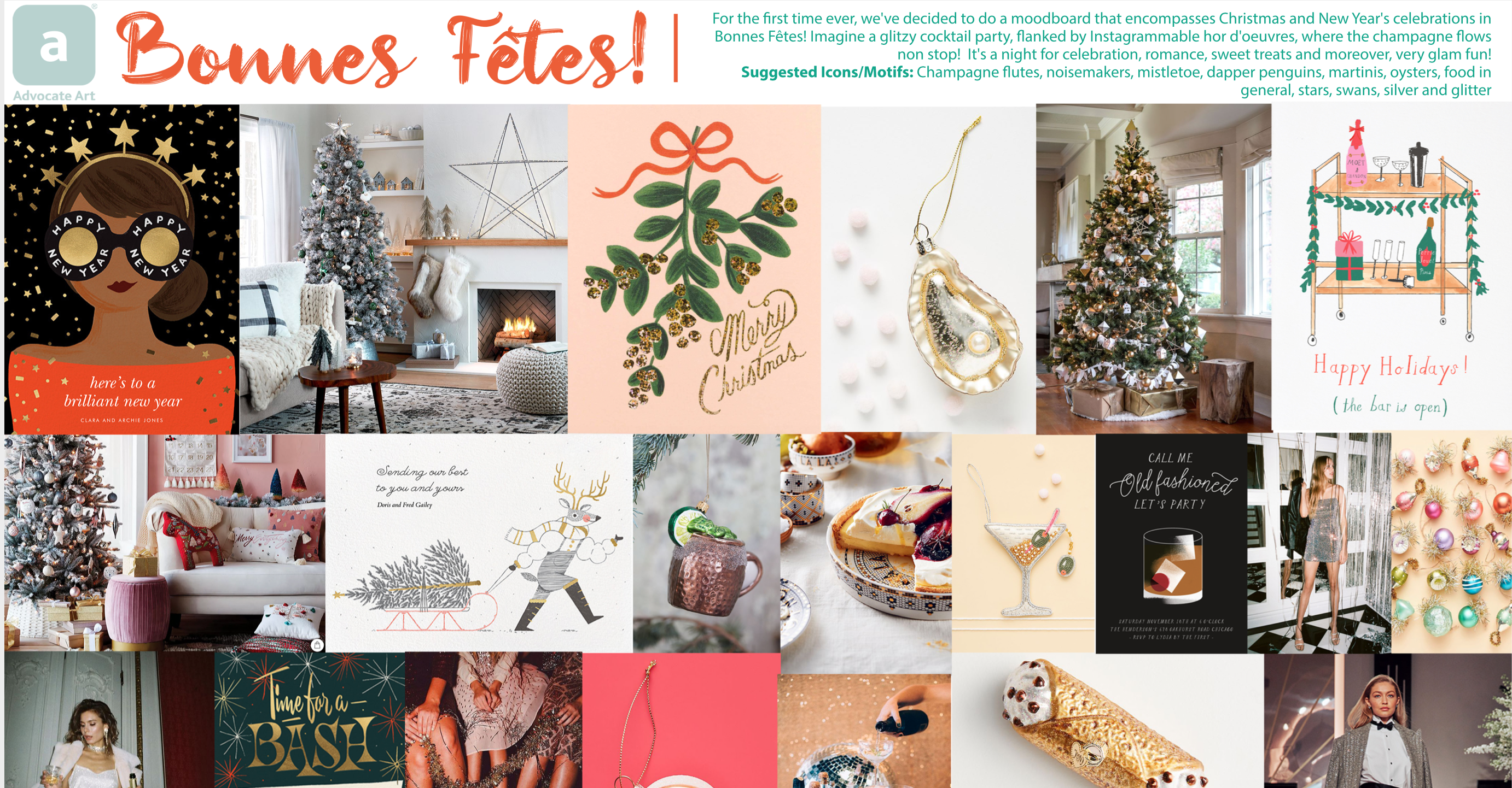
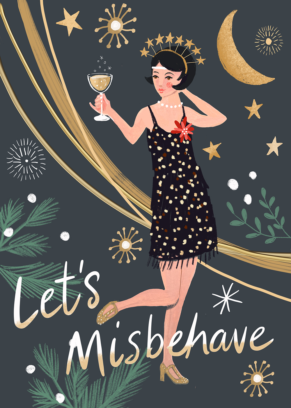
Bonne Fêtes: “After Covid, we believe that celebration will be a big thing for everyone, and swanky cocktail parties, glitter and glamour paired with elegant muted tones will be a trend with pops of colours to add contrasting accents.”

Above: A celebratory image by Sharon Montgomery (from Advocate).
Above: Advocate’s mood board for its Boogie Wonderland trend.

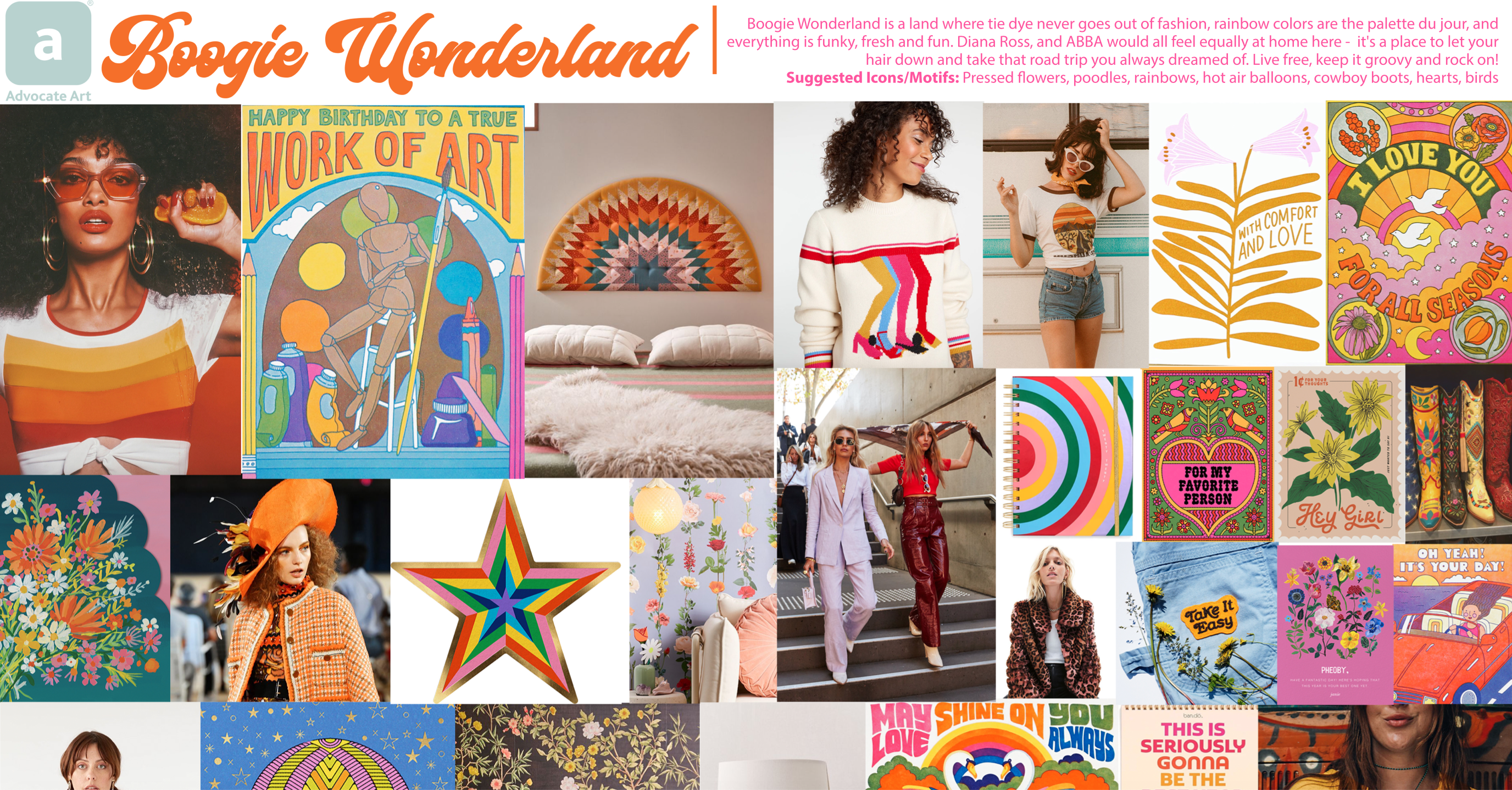
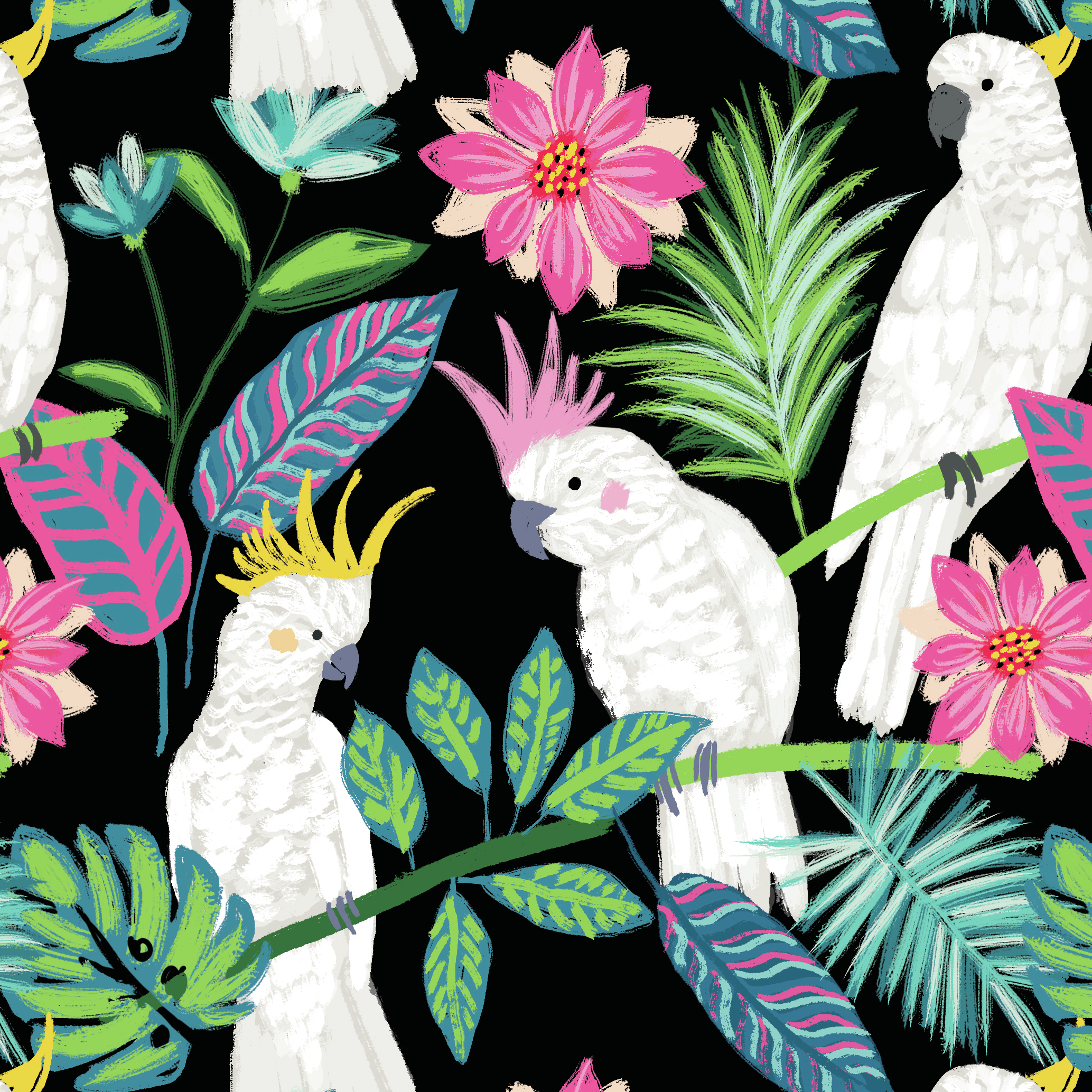
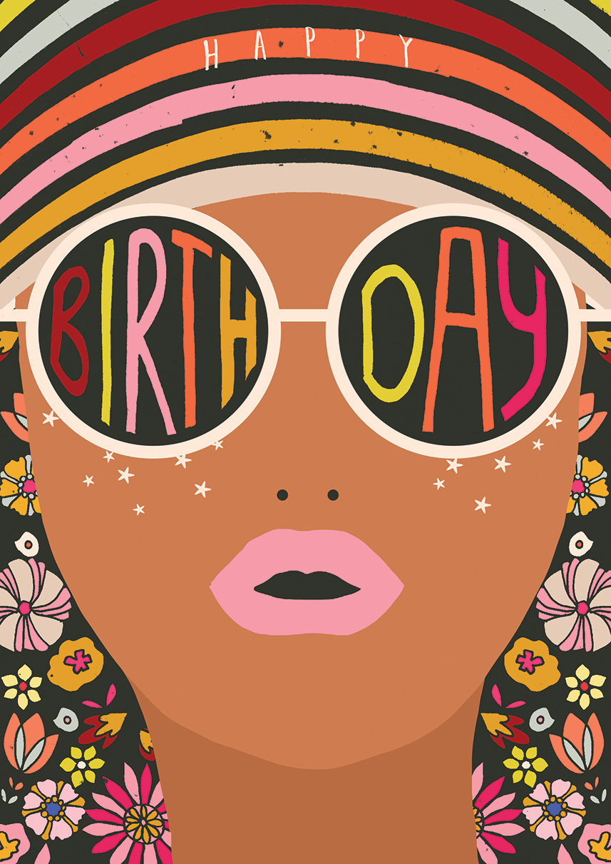
Boogie Wonderland: “This Retro look is making a comeback and it’s all about projecting positivity. We love the graphic, bold patterns, bright colours, integrated type and vector style. It’s a celebration of type and delivering empowering messages which tie in well with how big of a trend mindfulness has become too.”

Above: A positive retro vibe from Rebecca Prinn (from Advocate).
Above: Advocate’s mood board for its Blazing Hotchpotch trend.

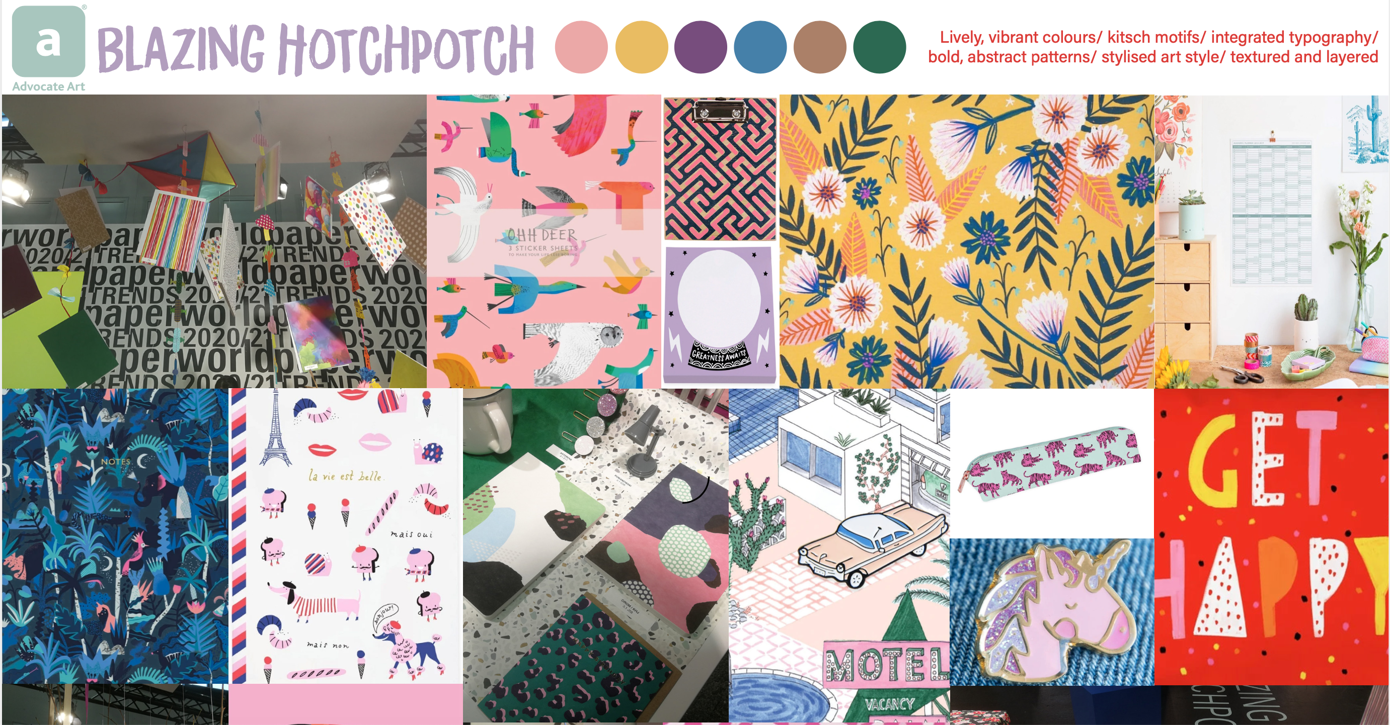
Blazing Hotchpotch: “This trend is also very graphic and stylised, that makes the Kitsch look trendy. The colour palettes revolve around the Pantone colours of the year; PANTONE 17-5104 Ultimate Gray + PANTONE 13-0647 Illuminating Yellow. We think more contrasting, minimal colour palettes will be leading the way in design and be more texture focused too.”

Above: Dramatic contrasting colours from Charlotte Pepper (from Advocate).


MORE NEWS
Temu sfn Feature Image
 
Chinese platform known for ripped-off greeting cards wants to sign up UK sellers...
Tesco PO Feature Image
 
Grocery giant shows interest in acquiring 108 Crown Post Office outlets...
PG pub Feature Image
 
PG's pub was a hub for thirsty greetings folk at Spring Fair...
Thortful AI Feature Image
 
Thortful’s latest tech swaps personalised features on greetings designs...
Tiger Feet VD Feature Image
 
Valentine’s Day cards and long-lasting foil balloons are Tiger Feet’s top earners ...
Greats entry Feature Image
 
Closing date for 23rd annual gift retailer awards is Tuesday, 11 February...
Get the latest news sent to your inbox
Subscribe to our daily newsletter

The list doesn't exist! Make sure you have imported the list on the 'Manage List Forms' page.