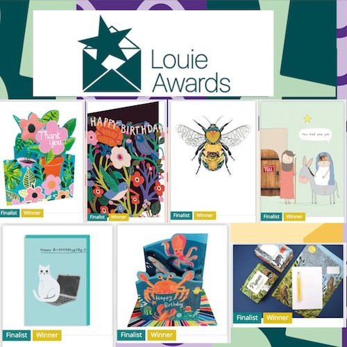
Picture libraries and artist agencies are not just a great source of imagery for greeting card publishers, but due to their wide reach into other fields are also quick to gauge design trends and influences on the aesthetic.
Here, Hannah Curtis, director of The Bright Agency shares what she feels will be driving our design tastes and reveals a trio of trends.

Movers & Shakers 2020
“I feel we will feel the extent of…
- The Tokyo Olympics/Japonnais trend
- A destabilising effect of the Brexit deadline and US presidential elections
- Pantone’s spring palette selection – ‘Mosaic Blue’, ‘Flame Scarlet’, ‘Saffron’, ‘Orange Peel’ – striking, bold colours with primary base.
- Environmental consciousness and responsibility – the impact we are, globally, having upon the natural world reflected in Pantone’s Colour of the Year being ‘Classic Blue’.”
A trio of art & design trends 2020
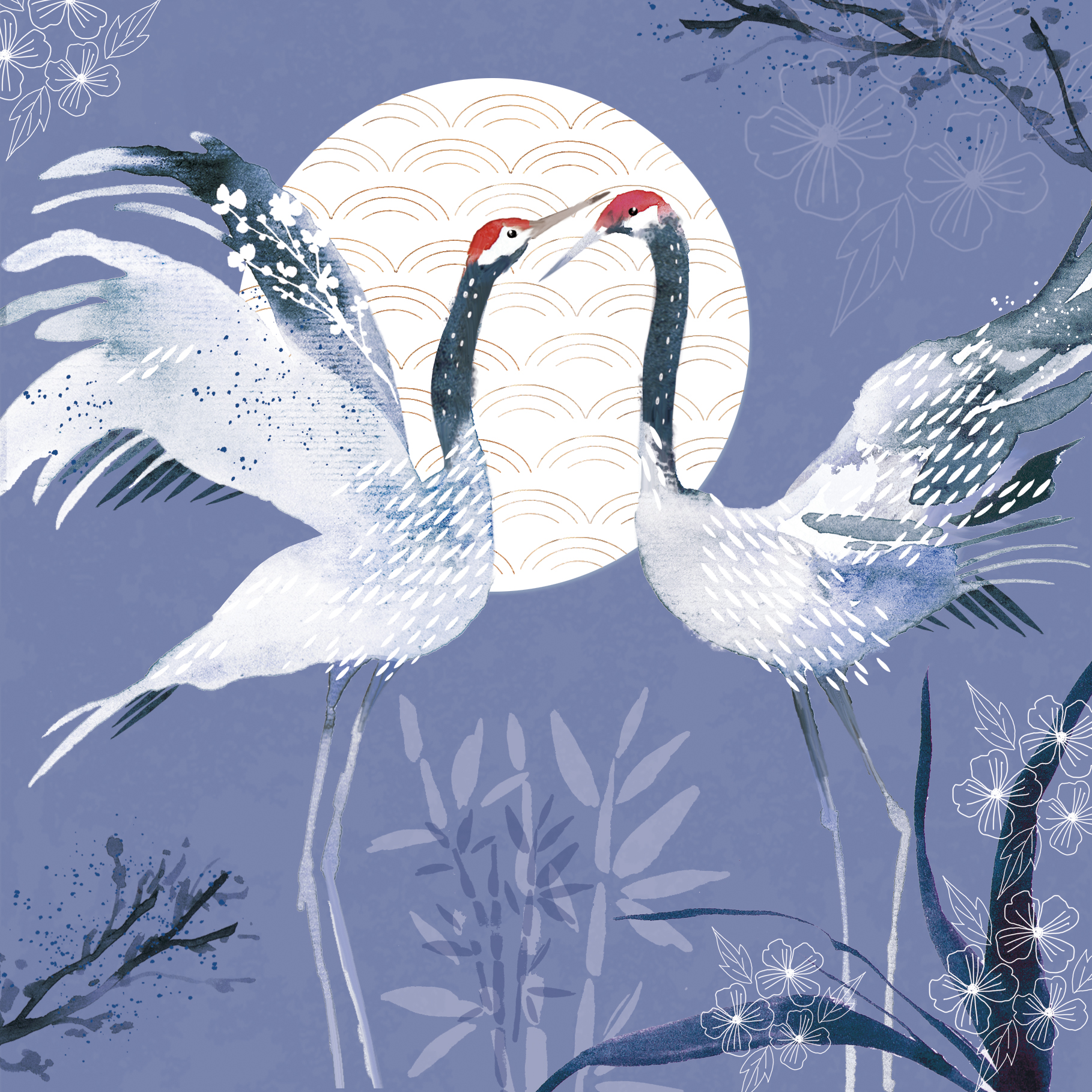
Tokyo muse: “The summer of 2020 will see Tokyo host the Olympics and Japanese-inspired art and craft look set to be important influences in design. We are already seeing a Japanese aesthetic in the popularity of motifs such as Japanese cranes and pattern designs reminiscent of richly-patterned kimono fabrics, interwoven with metallic threads and embroidery that bring a sense of understated, lovingly-preserved luxury, but the search for authenticity – a continuation of the trend for ‘artisan’ products of previous years – also identifies the beauty found in traditional Japanese craft techniques that explore the integrity of materials and the practice of mending, repairing and reinventing, popularised by Instagram and ‘handmade’ marketplace sites such as Etsy.
This, in turn, reflects a move away from disposable ‘single-use’ mass culture and a reverence for history and the ‘life’ of an artefact. We are expecting designs that capture a slightly faded grandeur, that combine new aesthetics with old, to create something unexpected but beautiful in their reminiscence of traditional Japanese culture to be key in the coming year.”
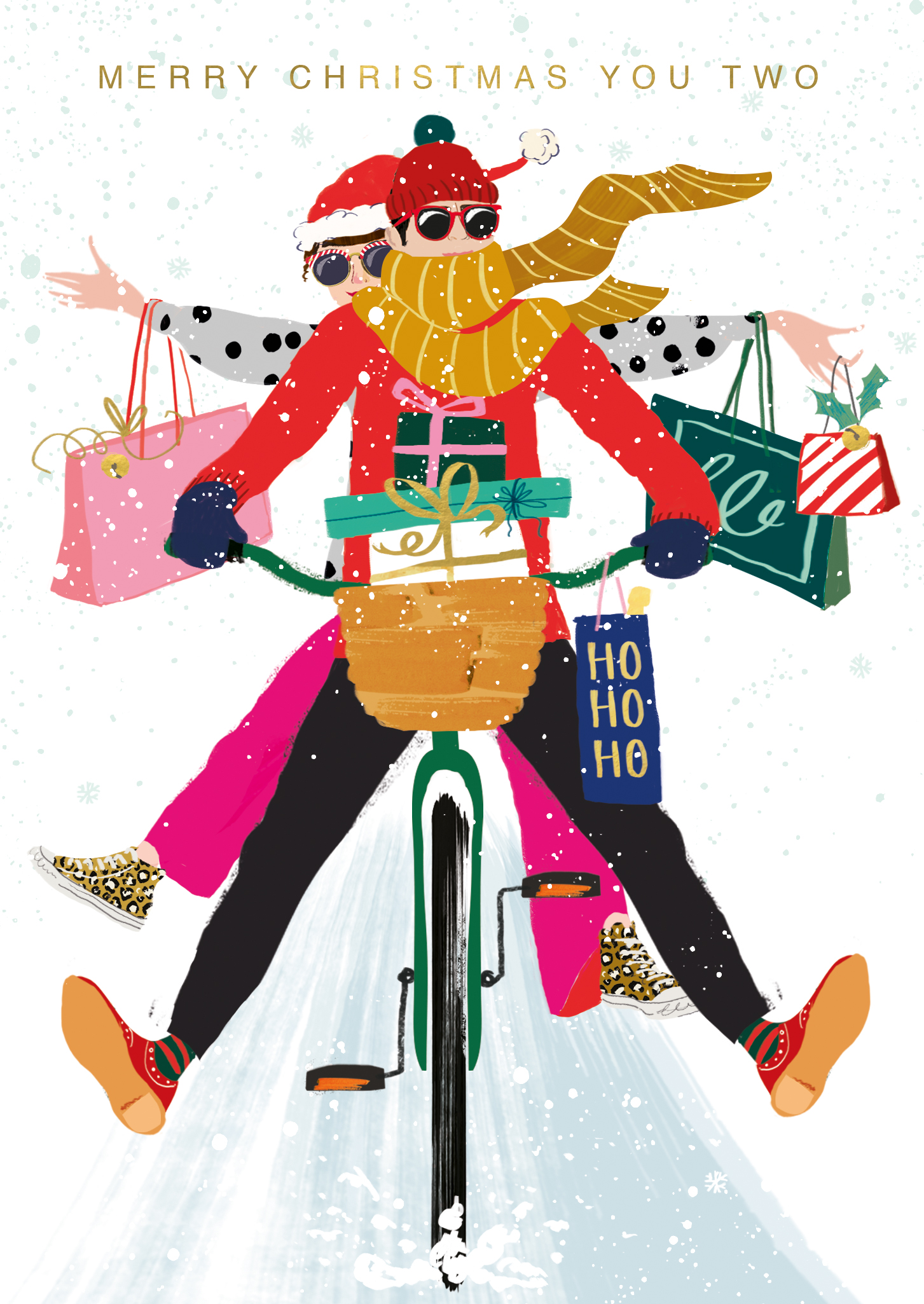
Joie de vivre: “The US Presidential Election in November 2020 and Britain’s long-awaited exit from the EU, are two hugely significant political events with potentially global impact. The climate of uncertainty that has attended both – most particularly that which has plagued ‘Brexit’ for the last three years – seems to have motivated a move towards (or even need for) design that embodies a sense of fun and a bright, optimistic colour palette that will transcend the fairly desperate, and almost unbelievable, conditions we find ourselves in.
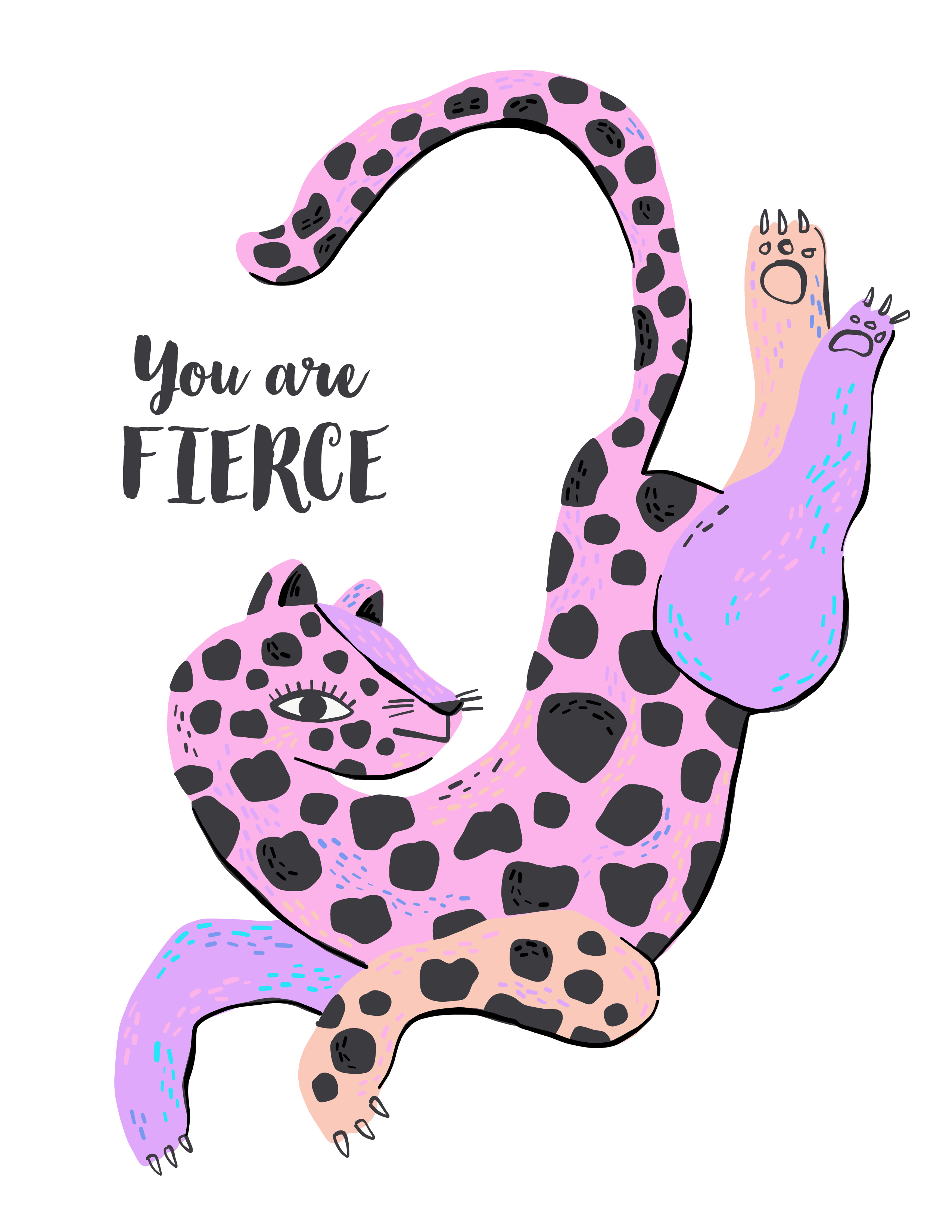
The bold colours, just a step or two removed from the primary palette, forecast by Pantone for Spring of 2020 – including Flame Scarlet, Classic Blue and Saffron – really capture that vibrant, concertedly positive mood. We think design that combines this with an edge of humour and an unapologetic joie de vivre will be hugely sought after in the coming year, as a welcome antidote to the general weariness and trepidation!”
Nature’s rally call: “Although it has been a key trend for a couple of years now, a sense of our environmental responsibilities is only becoming more acute, and this increasingly impassioned feeling is played out in trends that both celebrate the natural world but that also rally us to action. Designs featuring or referencing ‘wild’ animals/endangered species and environments that draw attention to their beauty – but also fragility and the need to be bold in our efforts to protect – we feel are going to continue to be popular.
The industry has already made some radical changes to the way it packages and finishes greetings and stationery products, but we are expecting this to escalate, with a move towards more emphasis on colour, pattern and texture to add interest in place of flitter elements, and with a more naïve aesthetic overall.”
